- TV OS
- 10-foot UI
- Design system
- Remote + screen
TiVo OS — the smart TV experience
Problem
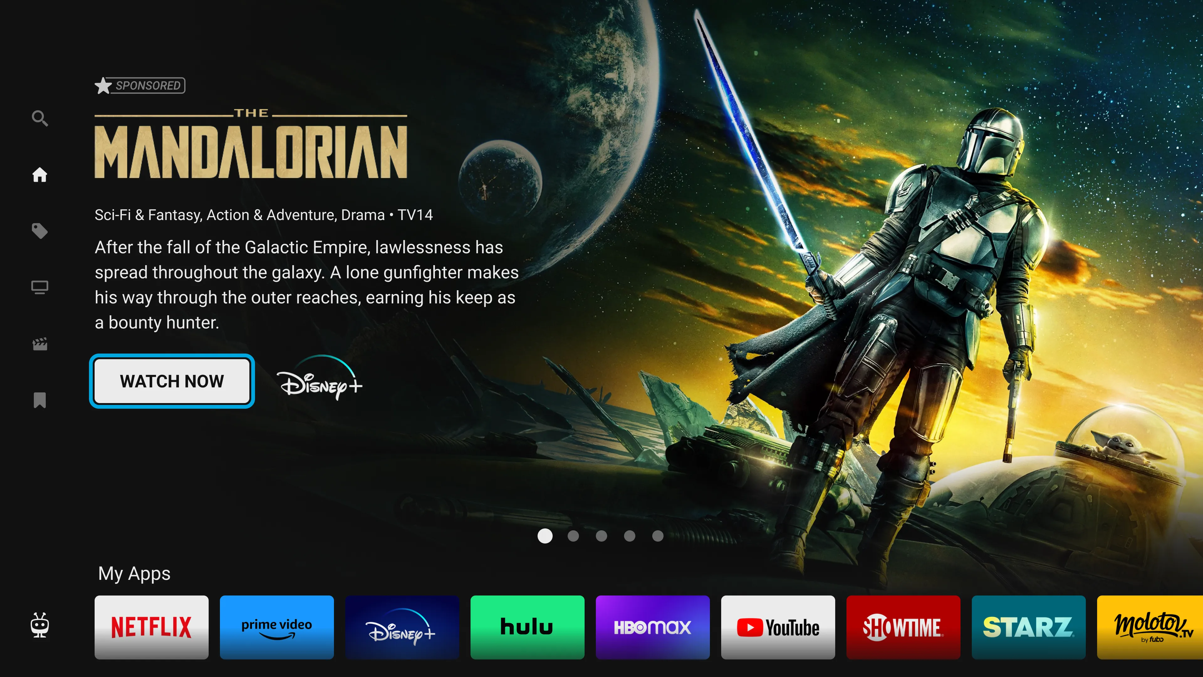
TiVo OS shipped as the default operating system on a class of smart TVs that, until recently, ran a different OS on every brand and a different one again on every panel size within a brand. The brief was to build the kind of OS that disappears — coherent across hardware, fast to navigate by remote, and rich enough to support a real content business underneath it.
The job was the system, not the screens. Every individual screen mattered, but the win was a TV OS that felt like one product even though it was running on hardware from multiple manufacturers.
Approach
I led UX across the home experience, content rows, settings, and the cross-cutting design system that everything composed against. The work split into three phases.
1. The grammar of a TV OS
Smart TVs sit ten feet from a couch. The interaction vocabulary is tiny — D-pad, OK, back, home, voice — and the visual budget per glance is small. The first phase was establishing the grammar: focus state, motion language, content tile shape, the way containers nest.
2. The home
Home is the only screen every user sees, every time. We rebuilt it around a content-first model — the row you’re watching, the row you watch most, the row a partner is paying to surface — composed dynamically per user and per market.
3. The design system
A TV OS that runs on different hardware needs a design system that travels. We treated the visual layer as a set of tokens — color, motion, typography, focus behavior — that could be themed per partner without breaking the underlying interaction model.
What we learned

The remote is the product
Almost every research session came back to the remote. People don’t navigate a TV with their eyes — they navigate it with their thumb, and the visual interface is a feedback loop on what their thumb is doing. Once that landed, remote-first interaction became the through-line for everything else.
Outcome
Reflection
The piece I’m proudest of isn’t a screen — it’s the focus model. On a TV, “where is the cursor” is the entire UX. Get the focus model right and most of the rest of the OS becomes possible to build. Get it wrong and every screen has to fight gravity. We spent disproportionate time on what looked like a small motion spec, and it paid for itself across every team that consumed the design system afterward.