- Automotive HMI
- Safety-critical UX
- Multi-display
In-vehicle entertainment UX
Problem
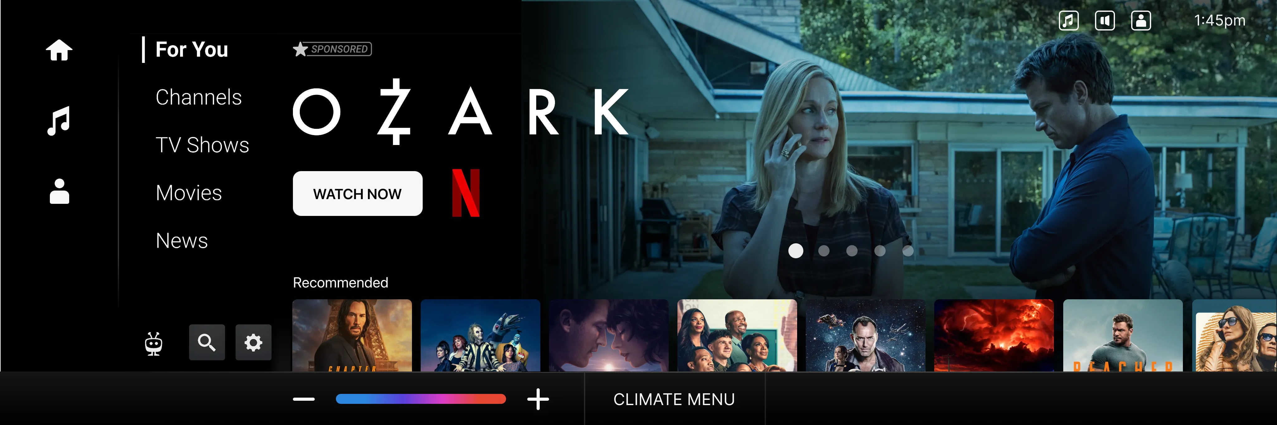
In-cabin entertainment is two products, not one. The driver gets a few square inches of screen, almost no sustained attention, and a hard regulatory ceiling on what the interface can ask of them. The back-seat passenger gets a full screen, full attention, and roughly the same expectations they’d have on a tablet at home.
The challenge wasn’t building two separate products — it was making them feel like one coherent system, with the same content library and the same user identity, while honoring the fact that the rules are completely different on each side of the vehicle.
Approach
The core idea was a content model that could compose itself differently for each surface. The same content row that renders as a full grid on the back-seat display renders as a few-tile glance on the dashboard, and as a voice prompt for the driver — but it’s the same underlying content state, with one source of truth.
Driver-side: glance, never read
For the dashboard surface, every interaction had to be answerable at a glance, in peripheral vision. The driver-side vocabulary collapsed to a small set of glance-shaped tiles — a poster, a single line of metadata, a state badge — and stripped everything else.
Passenger-side: a full product
The back-seat surface had room to breathe. We treated the constraint as opportunity — long-form browse, deeper metadata, recommendations that could afford to take a second to explain themselves.
Hand-off semantics
The most interesting design problem was the hand-off: when a driver stops driving, when a passenger boards, when a session pauses and resumes the next time the vehicle starts. We modeled the vehicle as a multi-occupant device with a primary surface and several secondary surfaces, each with its own focus state.
Outcome
Reflection
The temptation in automotive UX is to scope it as a UI problem on a smaller screen. It isn’t. It’s an attention problem, a regulatory problem, and a multi-occupant identity problem disguised as a UI problem. The interface design only works once the system underneath is right — who’s looking at the screen, why, for how long, and what happens when that changes.